Pushing Against The Walls: Tyler Emerson-Dorsch speaks with Jenny Brillhart and Carolyn Salas about their exhibition Cut-Outs at Dimensions Variable.

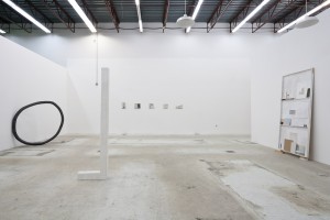
Exhibition view, Cut Outs – Jenny Brillhart and Carolyn Salas, January 26 – March 21, 2013, Courtesy of Emerson Dorsch
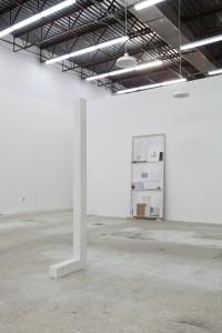
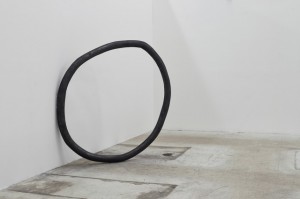
Jenny Brillhart’s two paintings bring a bit of her studio into the publicness of the exhibition space. Carolyn Salas’s two sculptures stand isolated from one another, and all the works almost float in a tall, fluorescent-lit white gallery. Despite this, the Dimensions Variable space feels cozy somehow. When I entered, I felt privileged to be inside an inner sanctum of delicate, subtle work. Brillhart’s “Vagabond” is made of five architectural detail paintings on drywall fragments, evenly spaced and propped on nails tacked onto a horizontal line drawn in pencil. Her other work houses small objects and paintings in neutral shades inside a door-shaped display box. The impression of intimacy was helped by Salas’ sculptures, which structured the space, from her mottled white “L” to her steely gray slightly misshapen circle, “O”, leaning against a wall. During the opening reception many viewers held their breath, yet children ran laps around the “L” and through the circle, before parents distracted them with other delights. In their exuberance the kids intuited that Jenny and Carolyn’s works were in harmony with the space and carried with them the amity of their making, a state of being protected and comforted, safe.
Tyler Emerson-Dorsch: Jenny, where did the title “Vagabond” come from? Why did you choose to display these particular architectural details in this format, on these supports?
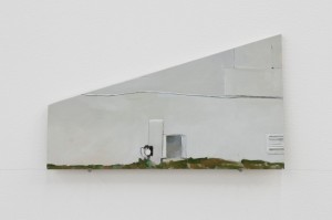
Jenny Brillhart: It is named after the hotel where I found the details I painted about. The format can be thought of, as fragments which could separate, and become somewhat nomadic, like a vagabond, though this connection wasn’t made until I titled the piece. The hotel has a long history. At the time of making the piece it sat abandoned with plywood boarding up the windows and a large fence around it, so I had to stick my camera nose between the chain links. Then it was painted white with all its boarded-up-ness already on there so many of the walls had this geometric layering, which I like. I thought to paint the scenes on random pieces of wood and drywall in my studio and garage, as a way to further instill the specific material with narrative and bring a function to under-used substance. Painting on leftover drywall and wood seems a bit parallel to painting about the building. I used odd shapes to refer to the abstraction and fragmentation of it. Finally, resting the pieces on a pencil and nail shelf underscores the relationship of the material to the wall, as well as the subject.
TED: You trained at the New York Academy for painting. This is a very academic background. One might expect someone with this training to studiously depict the figure, a whole building, or a whole landscape. Why the seeming fragmentation?
JB: Yes, my graduate training was very academic in a material sense and fairly void of today’s post-modern (is that where we are?) thinking. I chose this path because I wanted to understand paint and its technical specifics and to understand how to see. Basically I was, and still am, into form. At that time the process of making something out of the stuff that best suited the idea was too large to take on. My concern was medium, the materiality of paint and what it could do and still function as itself.
So, to answer “why the fragmentation of the piece”, my intuitive process has always let me see croppings or fragments of things and that probably originally led me to architecture. For this particular series it wouldn’t make sense to paint the entire hotel in its landscape. I view and record the hotel in little bits over time and I want that process to be present, and also show what I find interesting and relatable in the subject.
All of the pieces in the show revere the space’s support systems. My two pieces, with the wall, nails and line and secondarily the wall and floor. Carolyn’s also unite with the wall and floor as well as within the space itself – the air, maybe? The structure and presentation are embedded within the environment and the contents within each individual piece contains a larger, outgoing dialog. This helps to elevate these objects beyond their categories of “painting”, “sculpture” etc.
Carolyn’s circle [“O”] contains the content it frames as well as the graphite that closes her armature. It is almost a sculpted drawing. My works more timidly step outward in hopes that there can be a balance between beauty and concept. Does one negate the other? Maybe it does. Beauty is really the poetic, usually intuited, it is more process-based, and it is what one can’t control.
TED: Carolyn, your sculptures seem to fit so organically with bodies in space. They are relatively large – the “L” sculpture was about 7 feet tall, and the circle about 5 feet in diameter. They also seem like just the right intervention into DV’s space and with more economy and less flourish than previous pieces. Can you talk a bit about how you modeled the pieces in space and to what circumstances were you responding?
Carolyn Salas: Working on-site over the course of two weeks allowed me to let the expanse of the space determine the configuration of the sculptures. When initially working on this project I had several ideas in mind but when I arrived at DV and saw the high ceilings and “openness” of the gallery I knew exactly how I wanted to approach making the pieces. Lately I have been working with a certain scale that corresponds to human height. In this way I imagine the relationship to the body, how we maneuver through space, and our relationship to objects in space. When making the “O” and “L” structures I was thinking about symbolic shapes relating to code. The forms then develop a conversation or particular language with one another and the architecture by referencing particular bits of structural framework, or in using the walls as support. This builds a connection between what’s familiar and seemingly unfamiliar. I just started incorporating graphite powder into the works. This emphasis on line or gesture becomes heightened by its materiality. In order to find a balance between the two, I kept the works black and white in color, allowing the forms’ minimalist structures to be accentuated. The graphite applied to the “O” shape gives the object weight, while the cast plaster of the “L” makes the white almost disappear into the background, and they become sculptural drawings in space.
TED: Explain why the pieces, even scaled up, bear evidence of your hand?
CS: No matter what scale the works are they would show my hand. That “quirkiness” is something I like to see, the evidence that it was touched and not slickly manufactured. My work is very physical; it demands use of my body, helping in a way, pushing and pulling, the material. I then develop this closeness with the material. It becomes about the struggle to figure out how it will work. With each project a new obstacle arises that has to be figured out. In a way I build up this system that then gets broken down. It seems to be an endless cycle; that closeness is what draws me in. The sketch or drawing of the objects is one aspect, while their physicality and size is another. I tend to focus more on the motion or direction, guiding me to a place of memory where touching and feeling is how I am seeing.
Tyler, when you brought up Geston Bachelard’s book Poetics of Space I thought it was such a perfect reference for the show. My copy has been on the bookshelf since my undergrad days, worn and rifled through. I picked it up again and skimmed over it. A phrase stands out to me that seems poignant at that time:
“But actually this grandeur does not come from the spectacle witnessed, but from the unfathomable depths of vast thoughts. Baudelaire writes, ‘In certain almost supernatural states, the depth of life is entirely revealed in the spectacle, however ordinary, that we have before our eyes, and which becomes the symbol of it.’”[1]

Exhibition view, Cut Outs – Jenny Brillhart and Carolyn Salas, January 26 – March 21, 2013, Courtesy of Emerson Dorsch
Looking back at Jenny’s work there is such an eerie quality to her paintings, which makes me think of places I have been whether in a dream or waking state. With her leaning wall piece [“Inner 10”] and the organized objects…this placement and order is also familiar but yet can’t quite be placed. How we work and move through our daily lives, observing and digesting to create a sense of them. It is something that I think is captured in this combination of works, even if just for a moment in time…. bringing the outside in or vice-versa.
TED: Bachelard writes about subconscious memories of the house – the cellar, the attic, or the nooks where one takes shelter (or perceives shelter) to be alone and read or daydream. These memories are shaped – bracketed if you will – by the imprint of the way a certain corner supported the body back then, the body of a daydreamer. In Bachelard, the attic houses the daydreams of rational thought, while the cellar, in its connection to the earth, is a mysterious space that tends to draw out animalistic nature and other parts of our nature we tend to fear. At DV, with the soaring ceilings and wash of cool white light, it seems that we are in an attic space. Bachelard focuses on the imprint of intimate space from childhood, or even mankind’s childhood. But the space of the studio has as much power to be an intimate space of memory and embodied observation.
Jenny, can you describe your studio and how its space and your place in it comes into your work?
JB: For me the studio is a place of filtering material and image, and allows for time and memory to come into the work. What might be intended as a straightforward composition will inevitably also contain the energy of it’s own life at the studio. Sometimes I think of the paintings as one might appreciate a found object, in that they might not mean anything at first, but simply by inviting them into the work space and letting them hang around, they acquire something, not quite tangible, much like the multiple fleeting and ordinary thoughts and visions Bachelard refers to in the above quote. The studio practice is one of repetition and making and it is through that cycle that I believe things happen.
TED: Carolyn, the graphite circle piece, “O”, leans against a wall for support, a gesture which recalls all the reasons a body might lean against a wall. Can you talk about how you think about weight and stability in your sculptures in DV, and in general?
CS: The leaning sculpture comes from thinking about support structures that are typically hidden from plain view. Whether you’re looking at the architecture of a building, the structure of a boat or a stretcher bar, the internal support is essential. I like how the sculpture needs the wall, activating this otherwise white field with its round mass. I’m interested in the idea that the “O” sculpture gives an impression of resting, taking a break, and using the wall for support. There is something humorous in that the circle is less a like a circle and more like a wonky shape, and slightly battered. I can imagine seeing it having difficulty rolling. I think the circle might be humbled by its inaccuracy, hence needing a little help. Some of my more recent sculptures play off balancing weight, teetering on that moment where gravity must hold everything in place. Finding that tension within that space is something that interests me, like something on the verge of collapse.
TED: Jenny, your paintings all lean against the wall as well. Where Carolyn’s circle sags a little against the wall in a gesture that suggests rest, you support your small paintings on top of nails, which are tacked into a horizontally level graphite line, and lean them against the wall. Propped on scrap wood, “Inner 10” also leans against the wall. Why did you choose this system of support?
JB: Like Carolyn, I am also interested in support structures and what is often overlooked. I think the components of “Vagabond”, the nails and pencil line, are a comment on the wall’s “potential.” The wall not only covers the armature of the building, gives shelter, and privacy, it also holds up artwork that is about it’s own self! What a handy thing that wall is. This leads into the function and purpose of a painting or wall work. Is the purpose of the painting simply to comment on the wall? Well, not exactly, but perhaps it shouldn’t ignore its support. I am acknowledging the idea of painting as object. And possibly bringing forward the tension between the painted object and the more common perception of painting as decor, aesthetic, or telling narrative. There, I believe, is something related to function, architecture and that space in between.
TED: After a month of not being in the exhibition space and looking at the installation shots again, I am struck by the way Carolyn’s circle and Jenny’s shelf push against the space in opposite directions. Jenny’s five paintings on the back wall seem to float, while Carolyn’s “L” acts like an extender in text, making it more legible, and connecting to the heights from the ground. Jenny and Carolyn, do you have some final impressions of the installation views?
CS: I’m particularly liking how minimal the works are, allowing plenty of breathing room in between. I am currently working on several projects in the studio now that came from this specific grouping of sculptural works.
JB: I like how you describe the pieces as pushing the walls in the opposite direction. I think our use of the walls does have a specific visceral effect on the space, enlarging it or allowing it to open. The paintings in the back sit even further back, with the large sculptures in front heightening the perspective distance. This visual suits me.
Jenny Brillhart graduated with a BA from Smith College and received an MFA in from the New York Academy of Art. She lives and works in Miami, Florida. Brillhart currently has a solo show up at Kuckei + Kuckei in Berlin. She recently showed at ARCO Spain and Pulse Miami. In 2012, she participated in exhibitions with Dorsch Gallery, Dimensions Variable in Miami, the Sammlung SØR Rusche Museum in Germany and ArtCenter South Florida. In 2010 she showed new work with Kuckei + Kuckei Gallery and she was chosen for New Work Miami at the Miami Art Museum, curated by Rene Morales. Brillhart has participated in group shows including The Naples Museum of Art (Naples, FL), David Castillo Gallery (Miami, FL), the Anhaltinischen Gemäldegalerie Museum in Dessau, Roemerapotheke Gallery in Zurich, Morgan Lehman Gallery in NY, and ArtCenter/South Florida in Miami Beach. Her work has been published in Ocean Drive, The McKinsey Quarterly, New American Paintings and Miami Contemporary Artists.
Carolyn Salas was born in Hollywood, California. She received her MFA from CUNY Hunter College, NY in 2005. In 2011/2012 she was a Grant Nominee for the Rema Hort Mann Foundation Award. Salas has exhibited at museums including The Torrance Art Museum, Torrance, CA; Hudson Valley Center for Contemporary Art, Peekskill, NY and The Berkshire Museum, Pittsfield, MA. Recent gallery exhibitions include Santa Barbara Contemporary Arts Forum, Santa Barbara CA; Kate Werble Gallery, NY; BRIC Rotunda Gallery, Brooklyn, NY; Abrons Art Center, NY and Casey Kaplan, NY. Salas has recently completed the artist in residence program at the Fountainhead Residency, New York Art Residency & Studios (NARS) Foundation, NY: Abrons Art Center Studio Program, New York, NY; and the Elizabeth Foundation For the Arts Studio Program. Salas had her first solo show at Dodge Gallery in January of 2013. Salas lives and works in Brooklyn, NY.
Tags: Journal

